Ventev Mobile
Packaging System Redesign
Ventev makes mobile accessories targeted towards travelers. With product placement expanding in airports around the globe, I redesigned hard-to-read packaging with bright, simplified messaging.

I became familiar with the Ventev brand and existing packaging concerns while managing production art for multiple accessory lines. During this time, I created a formal brand guideline, and templates for consistency as the product lines grew.


The opposite face of the box shows the same information in an alternate language, and vendors can choose which orientation to display the packaging for their region. The final rebranded packaging pops on shelf, facilitates quick decision making for the customer, and features a cost-beneficial design that consolidates multiple regional packages into one solution.
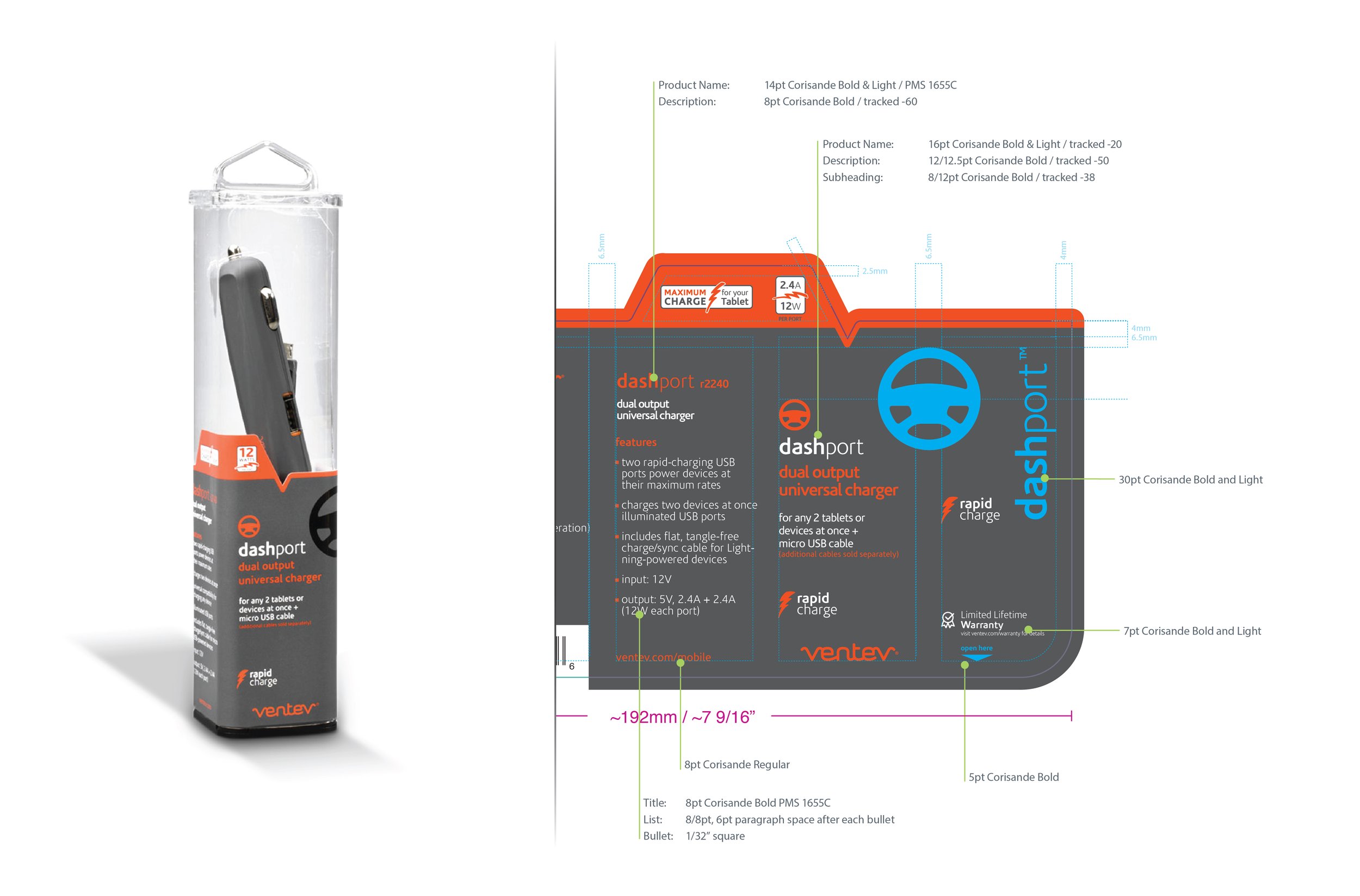
With the portfolio expanding, it was time for a packaging refresh to address ongoing communication obstacles, and draw more attention to the entry-tier product line. Central to the success of the redesign: improving visibility of the product compatibility information, and including multiple languages without prioritizing any one.
To begin, the structure was updated to remove the plastic product case, improving on both sustainability and cost. Hand-drawn environments ground the product photography, and enabled me to reduce wordy instructions. Callout flags highlight key compatibility information, while a simple instructional headline helps customers to quickly match a product to their need.
