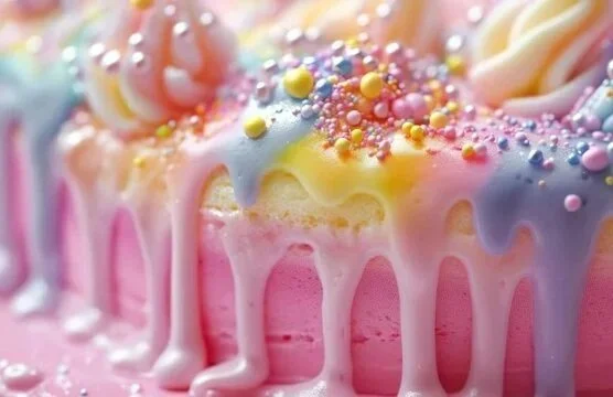
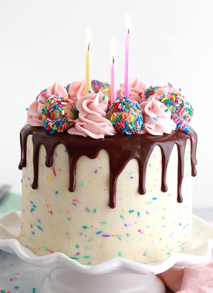
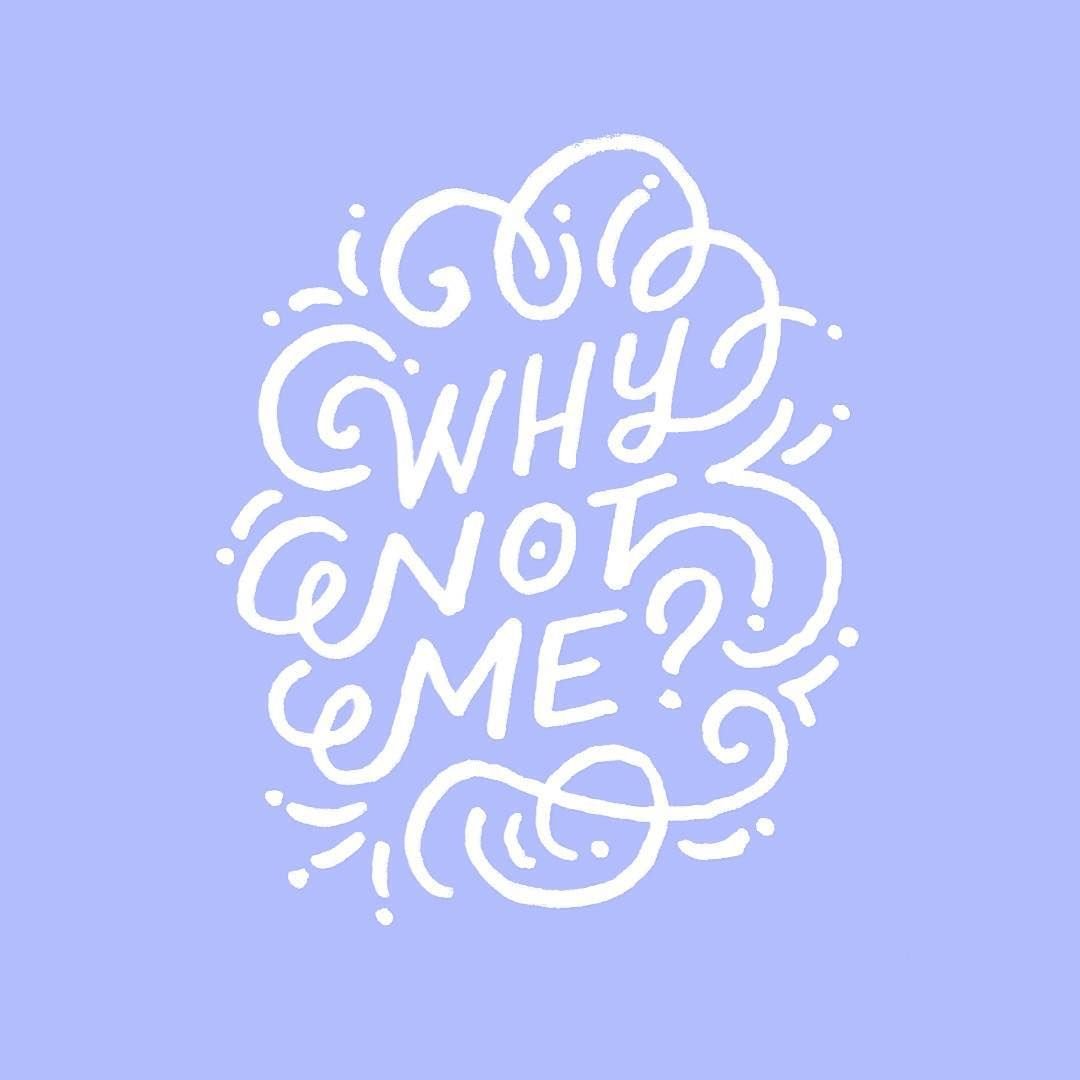
hi Carolyn! below are a few concepts I explored for your logo. I worked with the knowledge that this logo represents a bold, colorful, and sometimes whimsical brand. I played with the idea of a hidden reveal to try to tie in with your specialty as a realistic baker, blurring the line of perception.
Consider the sketches below a first draft for discussion. Please note that the ultimate graphic we finalize together will be more crisp and polished - it won’t be hand drawn unless you want it that way. If none of these are hitting the mark, that’s still a good starting point for discussion ;)
enjoy!
concept 1 | drip
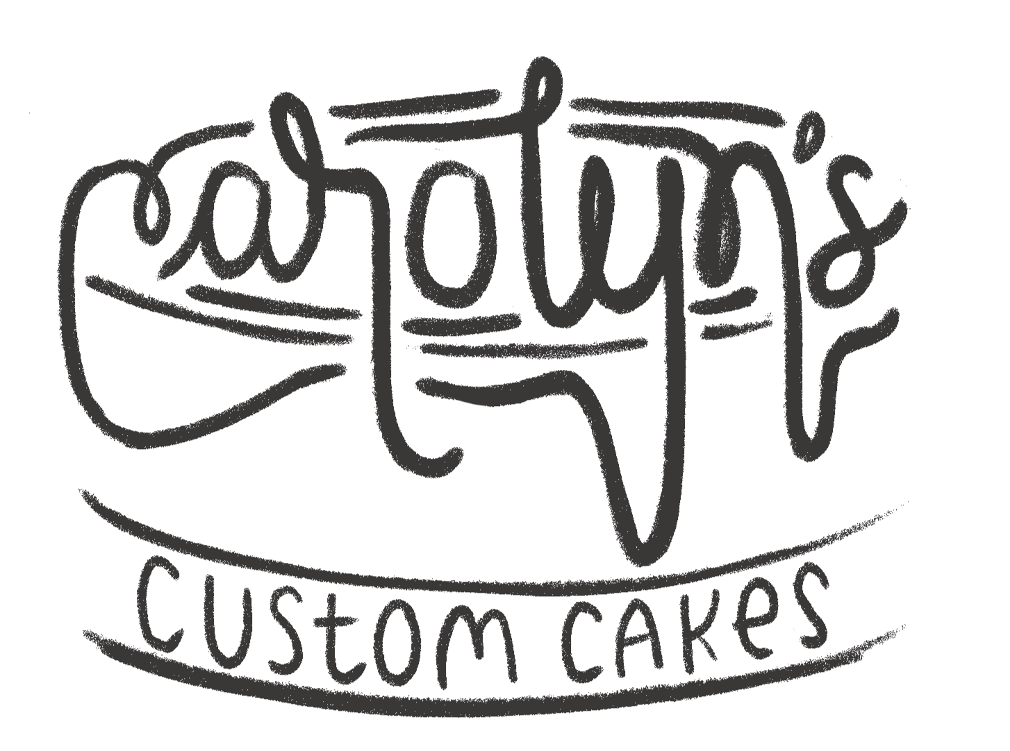
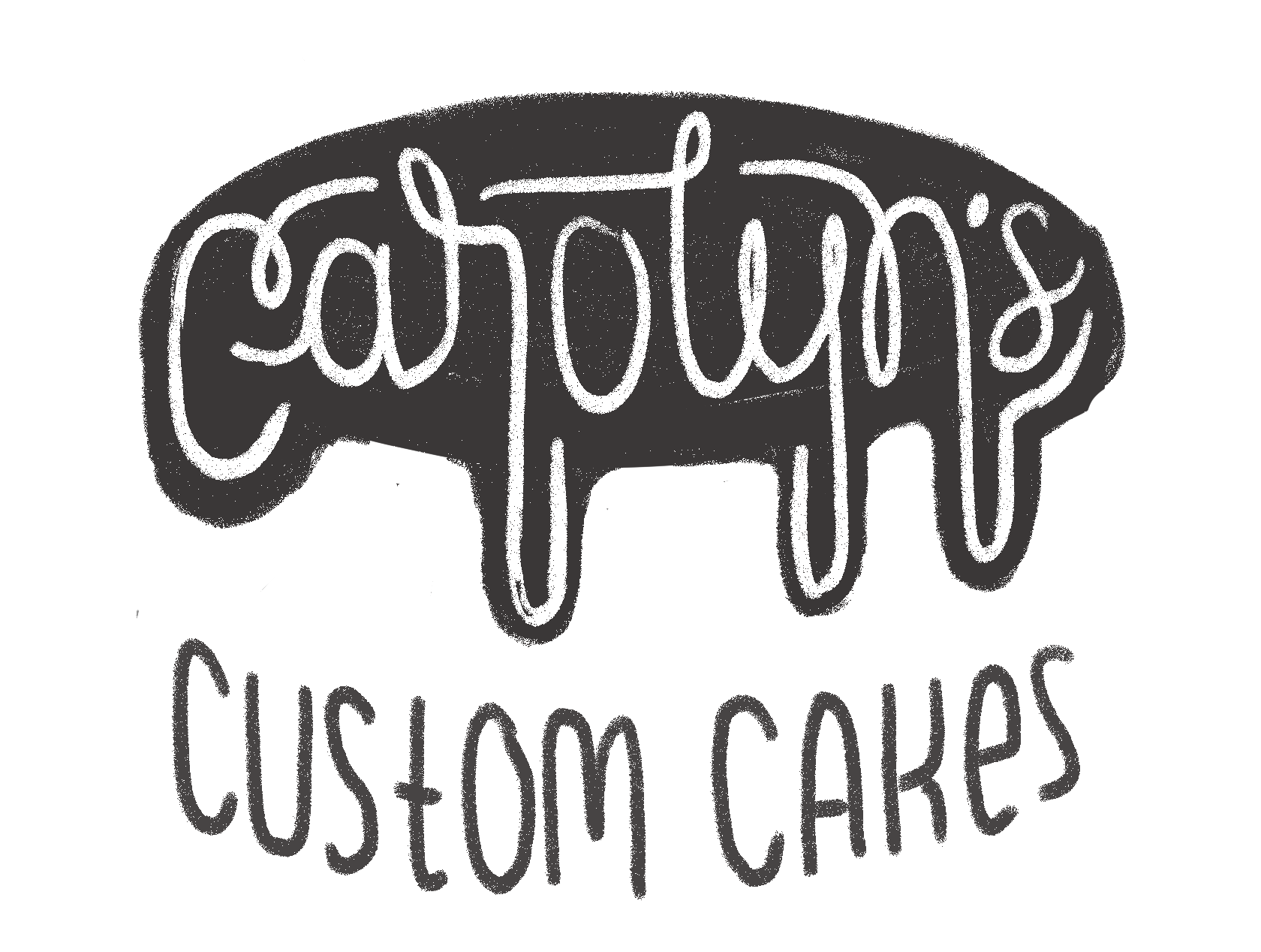
working the lettering into the drips,
not so hot. its trying too hard imo.
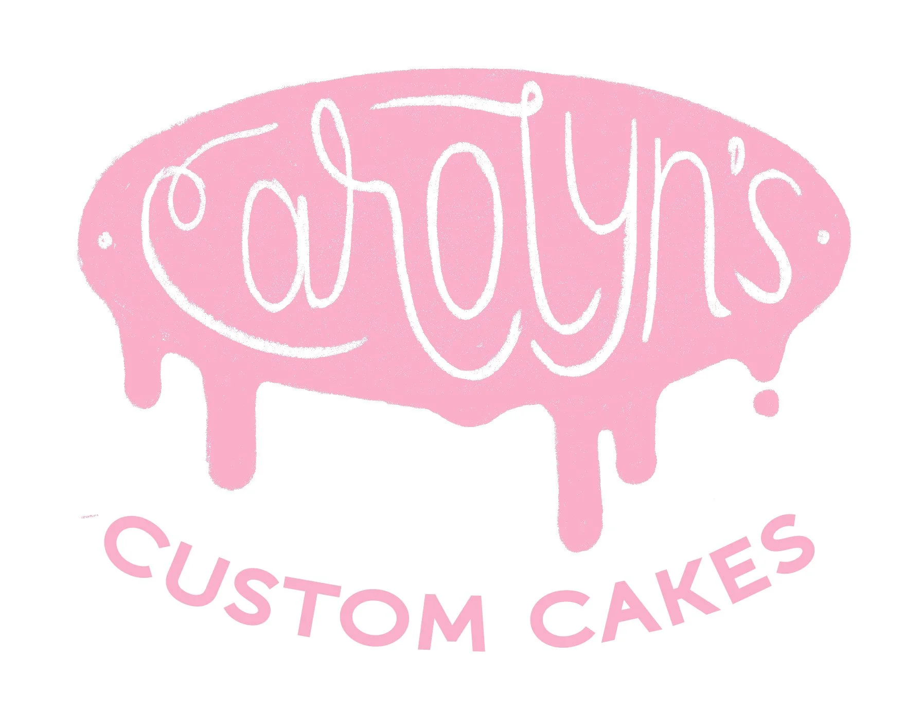
I think the contained lettering is more legible.
do the drips look more like blood than icing?
is there enough information that it registers as a cake shape?
I like this billowy looking script, if we pursue this option I’d want to try it with bolder lettering.
concept 2 | whisk-y business
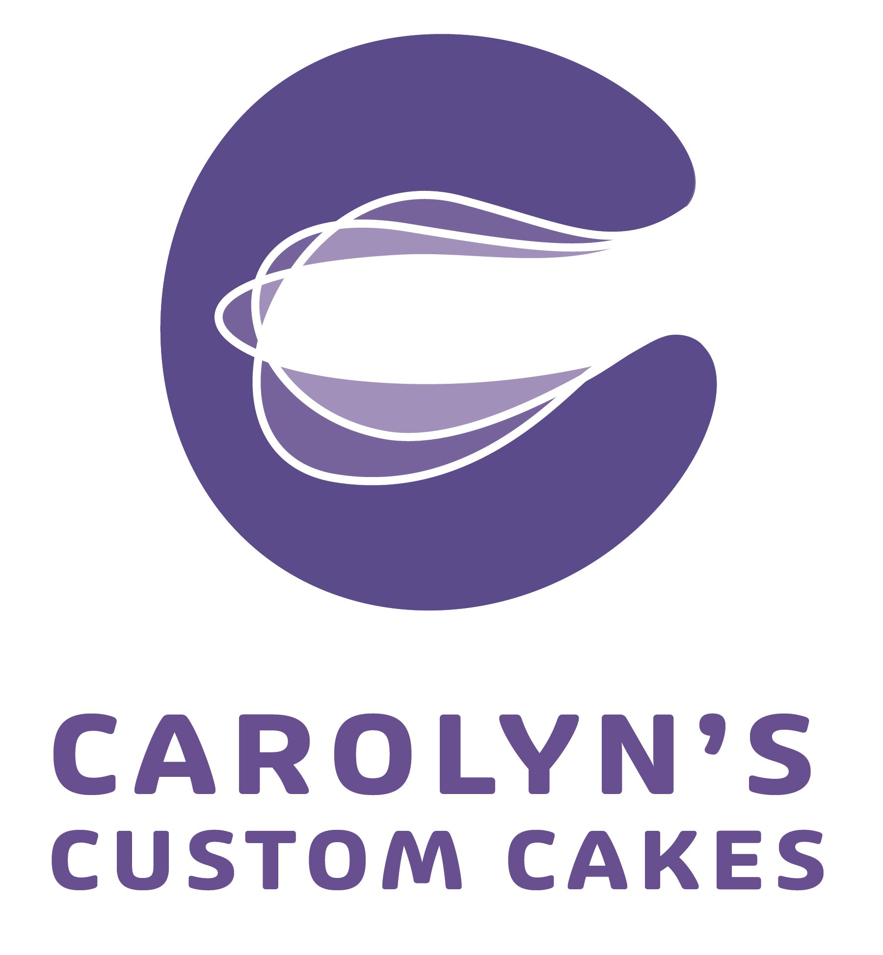
The whisk and letter contours are totally flexible here, I just wanted to see if it would read.
It might make a good stamp style medallion as well, since we’re already in a circular shape.
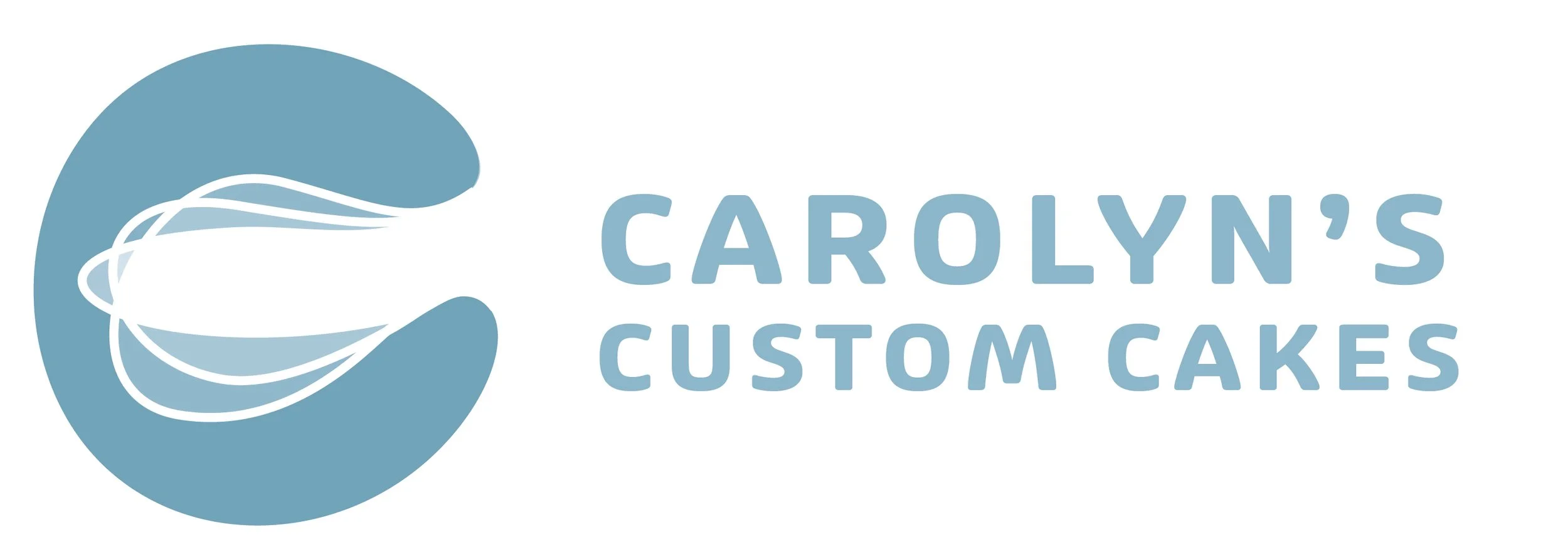
concept 3 | frosting
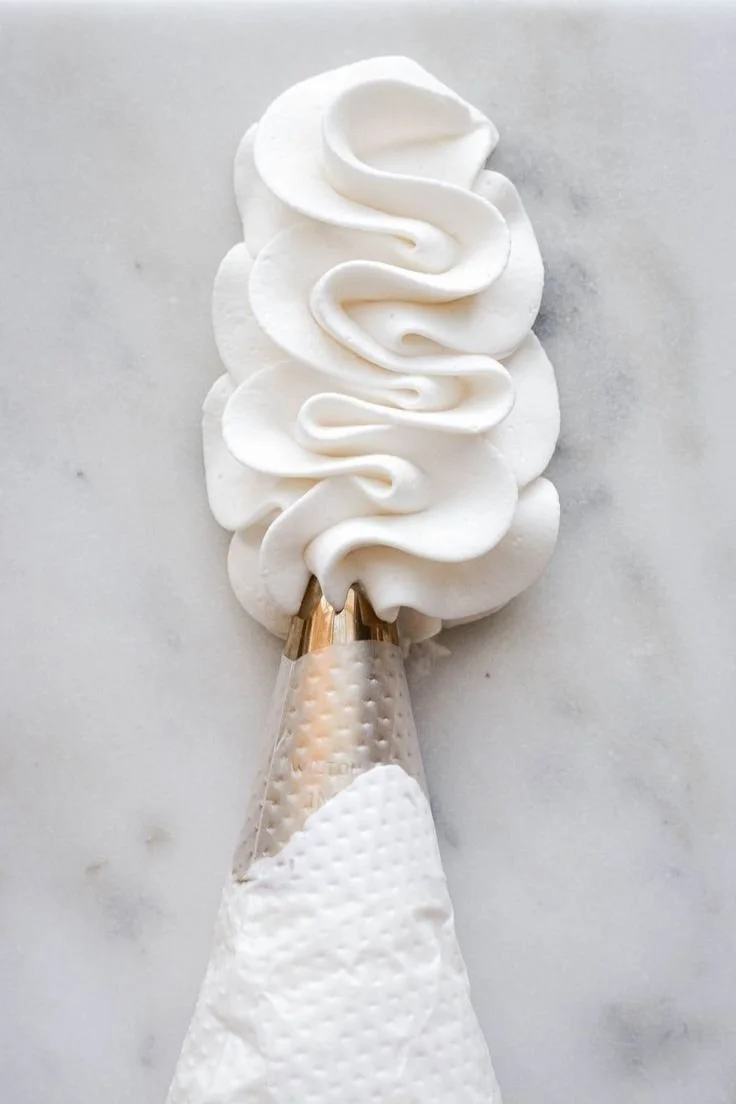
quick inspiration hits.
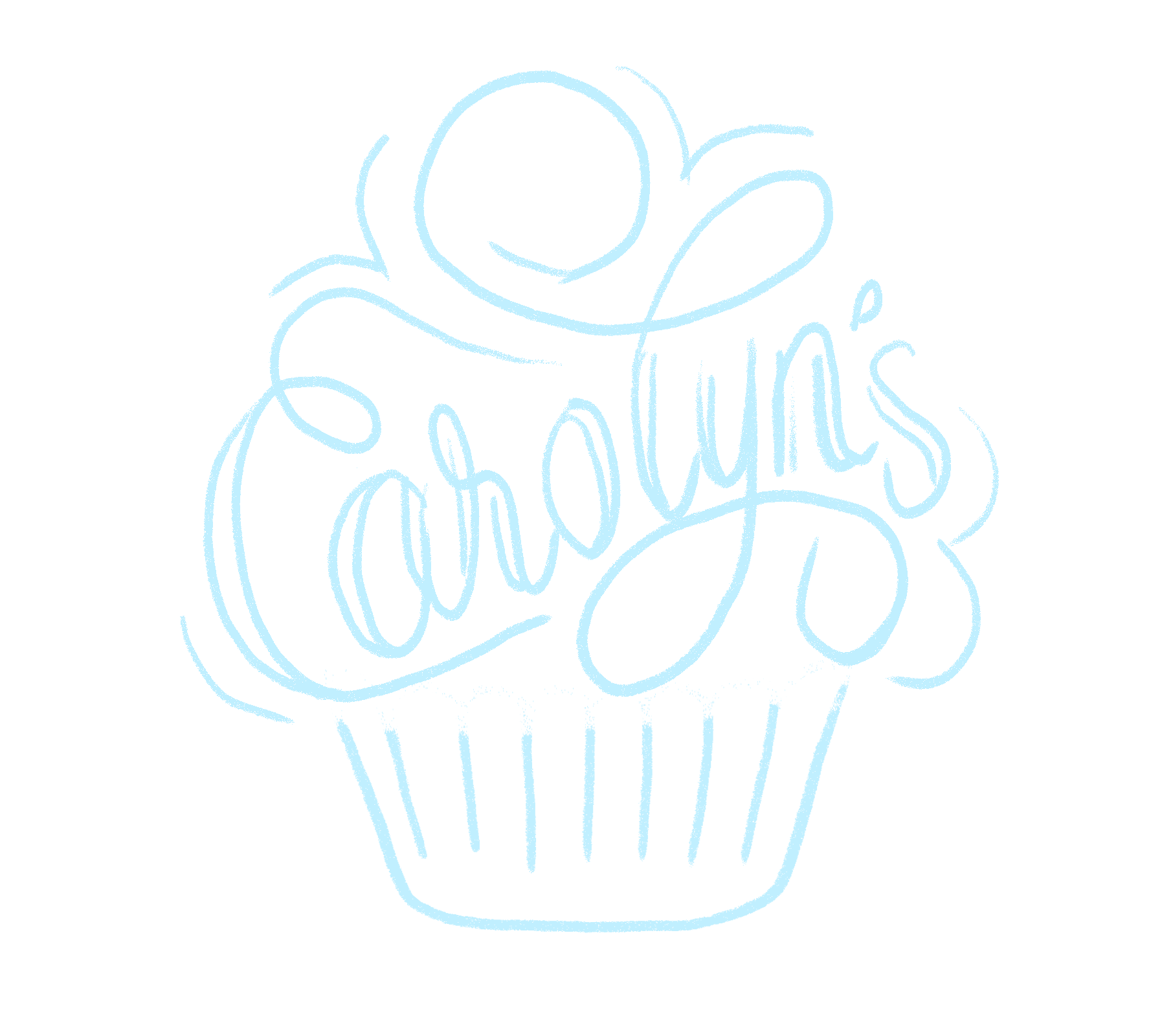
Script flourishes that define cupcake frosting were VERY fun to make! And maybe they are fun to read too. This one feels like it has the most traditionally bakery-esque aesthetic, but the important question:
is a cupcake appropriate if you want to move your focus away from that type of order? is it a strong enough symbol for baking that people wouldn’t get hung up on that?
Let me know your thoughts! xo